
What the AI Divergence Actually Means for Founders, VCs, and LPs
A set of Bravos Research charts is circulating as proof that AI is hollowing out the economy. The story underneath them is real, and it has already reached the asset class you invest in.

A set of charts has been moving through finance feeds for a few weeks, pulled from a Bravos Research video on YouTube:
Two lines that tracked each other for two decades, US job openings and industrial sales, split apart in November 2022, the month ChatGPT launched. Sales climb to records. Openings fall. The conclusion arrives without anyone having to argue for it. Machines are doing the work, the money keeps flowing, and the people are being left behind.
The video ends at the eight-minute mark with a pitch for a leveraged-long quant trading model “only available this week.” That is what the preceding seven minutes were built to deliver. The charts are persuasion, assembled to sell a subscription, which is reason enough to read them closely before forwarding them to your LPs as evidence of anything.
I read them closely. Some of the claims hold. Several of the charts are doing visual tricks, one of them is stamped with a number its own axes contradict, and one cannot show the thing it is being used to prove. The story underneath the theatrics is the one that matters, and it has already shown up in venture as the sharpest repricing of a business model in twenty years. Here is the honest version, and what it means for the people building, funding, and backing companies right now.
Read the charts before you trust them
Start with the one being shared most. It is also one of the few in the deck that holds up, which makes it the right place to begin.
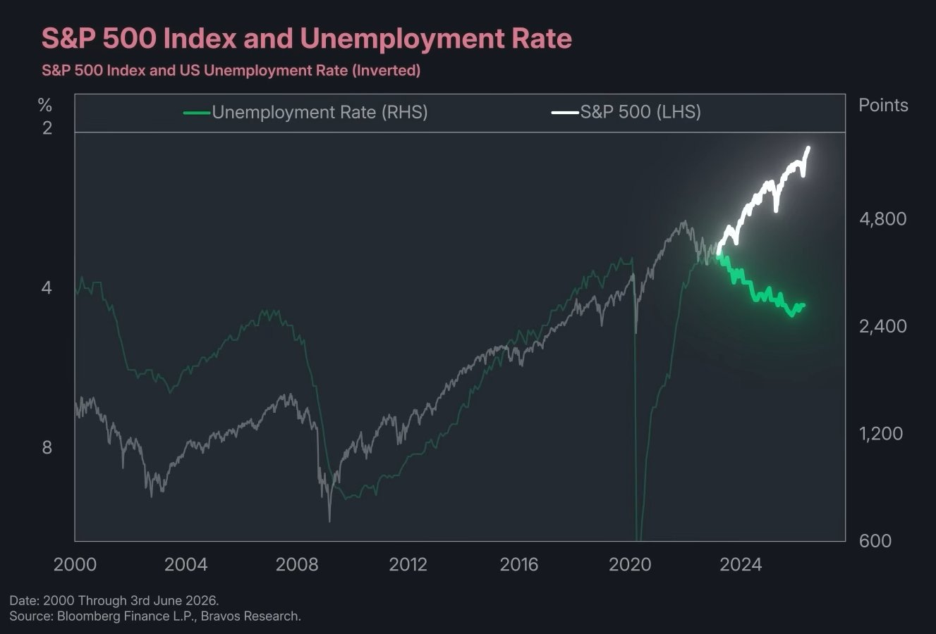
S&P 500 Index and US Unemployment Rate, inverted. Source: Bloomberg Finance L.P., Bravos Research.
The instinct is to wave this away because the unemployment axis is inverted. Resist it. Inverting unemployment is the standard way to show these two series together, and it is the right call here, because stocks and unemployment normally move in opposite directions. When the economy is healthy, the market rises and joblessness falls, so on an inverted axis the two lines climb together. For two decades they did exactly that, through the 2001 recession, the 2008 collapse, and both recoveries. The reason the chart is worth your time is that the lines have stopped climbing together. The S&P has run to records while unemployment has drifted up, and a relationship that survived two recessions has come apart. That is not a presentation trick. That is the signal.
The harder question is what is causing it, and there are three answers that all point in the same direction. The first is that the S&P 500 has stopped being a gauge of the American economy. The top ten companies now make up roughly forty percent of the index, the highest concentration on record, and the Magnificent Seven alone are about thirty-five percent, up from twelve percent in 2015. Most of those names are the AI infrastructure winners, and their value tracks global compute demand far more than it tracks US payrolls. When the index prints a record, that is now largely a statement about ten labor-light companies, not about the part of the economy that does the hiring. The second answer is margin expansion. The corporate sector is producing record revenue and profit while adding very few net workers, which is the same thing the job-openings chart shows from a different angle. Firms are converting higher output per employee into earnings rather than into headcount. The third answer is the one the video wants you to land on, direct AI substitution, and it is real but smaller than the chart implies. The displacement that shows up cleanly in the data is concentrated among entry-level workers, which I come to below, and it is not yet large enough to move the national unemployment rate by itself.
The three answers matter far more together than apart. Whether the tether between corporate value and labor demand is loosening because the index has become a concentrated bet on labor-light giants, because efficiency is lifting margins without hiring, or because AI is quietly removing the bottom rung, the underlying fact is identical. The link between what the corporate sector is worth and how many people it needs to employ is weaker than it has been in living memory. That is the real content of this chart, and it is structural rather than cyclical, which is what makes it a bigger deal than a single quarter of data.
One caution against over-reading it. Stocks lead the cycle and unemployment lags, so the two diverge around every turning point, and the move in unemployment so far, from a low near 3.4 percent to 4.3 percent, is modest and still historically strong. This is not a recession alarm. It is evidence that the machinery connecting markets to the workforce is changing, which is slower and more consequential than any recession call.
The discipline is needed on the rest of the deck, because the reassurance the video reaches for next does not survive contact with the data. It leans on two examples. One is wrong, and one is built on a chart that contradicts itself.
The Excel example first. The video says Microsoft Excel was released in 1993 and accountants thrived anyway. Excel shipped in 1985 for the Macintosh and reached Windows in 1987. The date is off by close to a decade, and the deeper problem is that the accounting case runs the wrong way for the argument. The Bureau of Labor Statistics projects employment of bookkeeping, accounting, and auditing clerks to fall six percent between 2024 and 2034, and it says plainly that software automated their tasks so the same work gets done with fewer people. Higher-skill accountants grew, modestly. Automation did hollow out the routine clerical layer. That is the displacement story, offered as a refutation of it.
The radiologist example is the one with the self-contradicting chart.
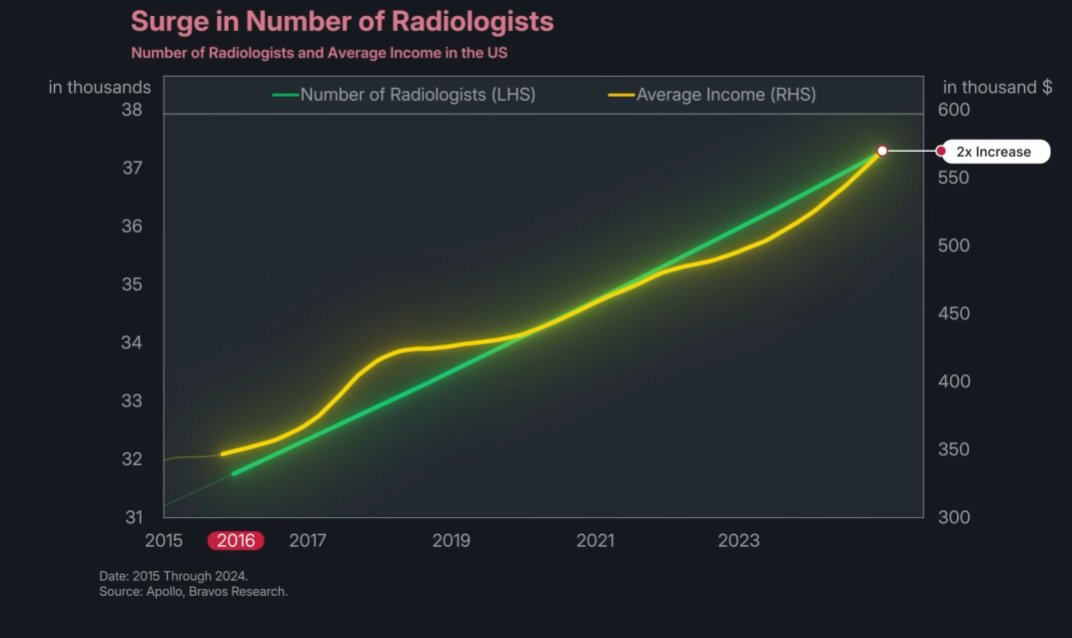
Number of Radiologists and Average Income in the US. Source: Apollo, Bravos Research.
The underlying point is sound. Geoffrey Hinton said in 2016 that we should stop training radiologists because deep learning would surpass them within five years, and instead the field grew and now faces a shortage. The Mayo Clinic’s radiology staff grew fifty-five percent over the period. So far so good. Now look at the chart’s own axes. The number of radiologists runs from about 31,500 to about 37,200, an increase of roughly eighteen percent. Average income runs from about $345,000 to about $565,000, an increase of roughly two-thirds. The chart is then stamped with a callout reading “2x Increase,” which neither line comes close to supporting. Medscape’s compensation surveys put radiologist pay near $400,000 in the mid-2010s and around $500,000 to $526,000 by 2024 and 2025, an increase on the order of a third. The growth is real and the direction is right. The doubling is invented, printed on top of data that says otherwise.
Then the Amazon chart, which is the clearest case of a graphic that cannot show what it is asked to show.
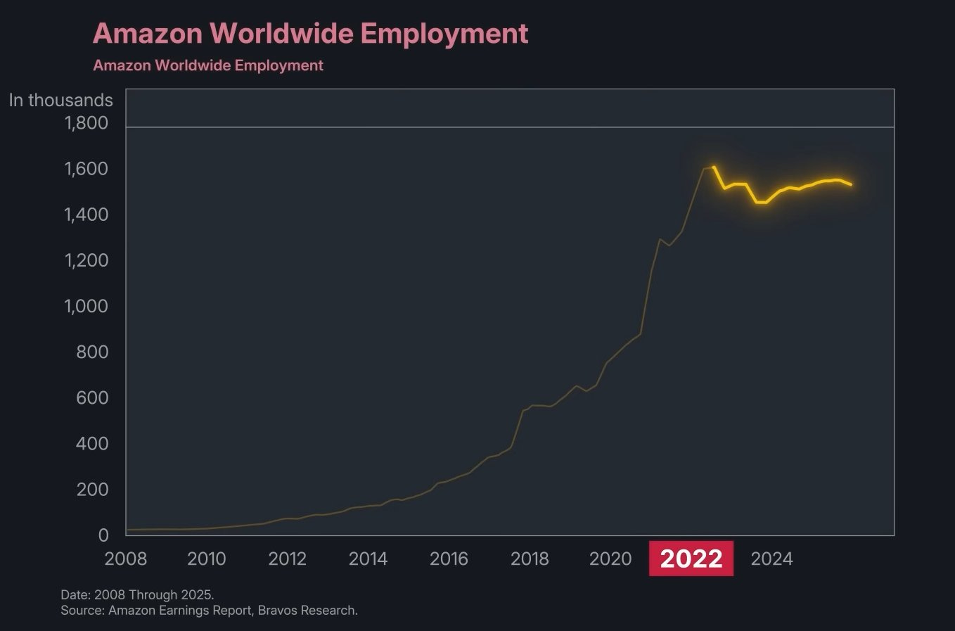
Amazon Worldwide Employment. Source: Amazon Earnings Report, Bravos Research.
The video says Amazon’s hiring “came to a complete standstill” after 2022 while the company spent “trillions” replacing workers with AI. The chart shows worldwide headcount rising explosively to a peak near 1.62 million around 2022, dipping, and recovering to roughly 1.55 million. That is a plateau after a once-in-a-generation hiring spree, not a standstill, and headcount actually rose again in 2024. More to the point, this is total worldwide employment, which is overwhelmingly warehouse labor. Amazon’s AI-driven cuts landed on its corporate workforce, about 350,000 people, where it eliminated roughly 14,000 roles in October 2025 and said advances in AI had raised its confidence in running leaner. Fourteen thousand corporate cuts are invisible inside a 1.5 million headline dominated by fulfillment centers. The chart they chose to prove the corporate-AI story is the one chart that structurally cannot show it.
One correction to my own earlier read, in the interest of accuracy. The “trillions” figure is wrong, since Amazon’s annual capex runs in the low hundreds of billions. But the claim that hyperscaler capex is approaching the entirety of operating cash flow is fair, and their own chart shows it.
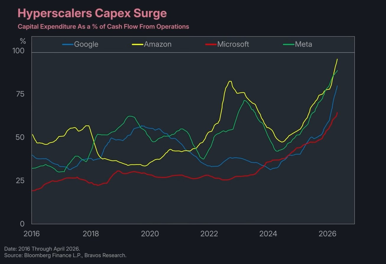
Capital Expenditure as a % of Cash Flow From Operations. Source: Bloomberg Finance L.P., Bravos Research.
By early 2026 Amazon and Meta are spending roughly ninety percent or more of operating cash flow on capex, with Google not far behind and Microsoft climbing fast. That is the real and important fact buried in a video full of unreal ones.
The story underneath the theatrics
Strip out the tricks and a genuine structural shift remains, and it is about capital, not headlines.
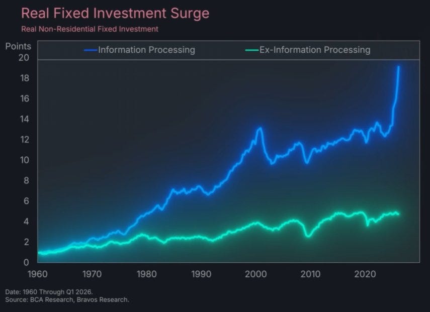
Real Non-Residential Fixed Investment. Source: BCA Research, Bravos Research.
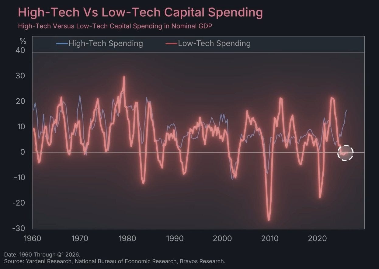
High-Tech Versus Low-Tech Capital Spending in Nominal GDP. Source: Yardeni Research, National Bureau of Economic Research, Bravos Research.
Investment in information processing has gone vertical while investment in everything else has flatlined, and high-tech capital spending is surging as low-tech spending sits near zero. This is the part outside analysts confirm without a sales motive. In the first half of 2025, AI-related capital expenditure contributed more to US GDP growth than all consumer spending combined, the first time data center buildout outweighed the American shopper as the engine of the economy. The five largest cloud and AI infrastructure companies have committed to somewhere between 660 and 750 billion dollars of capex in 2026, close to double the 2025 figure, with Amazon alone planning roughly 200 billion. Capital is being pulled into a narrow set of assets, chips, data centers, and the power to run them, and away from housing, transportation, and the broad industrial economy. Data centers employ very few people once built. That is the actual mechanism behind the chart everyone is sharing.
The labor effect is real too, and it is more specific and more uncomfortable than a macro divergence can show. The strongest evidence sits in payroll microdata, not in the video. Stanford economists Erik Brynjolfsson, Bharat Chandar, and Ruyu Chen, working with ADP records covering tens of millions of workers, found that early-career workers aged 22 to 25 in the most AI-exposed occupations have seen employment fall by roughly thirteen percent since late 2022, even after controlling for firm-level shocks. Older workers in the same roles held steady or grew. The damage is concentrated at the entry level, where the work is codified and learnable from text, and it is invisible in headline unemployment because it shows up as jobs that are never created rather than workers who are fired.
The honest counterweight, which the video skips and which I will not, is that the aggregate labor market is fine.
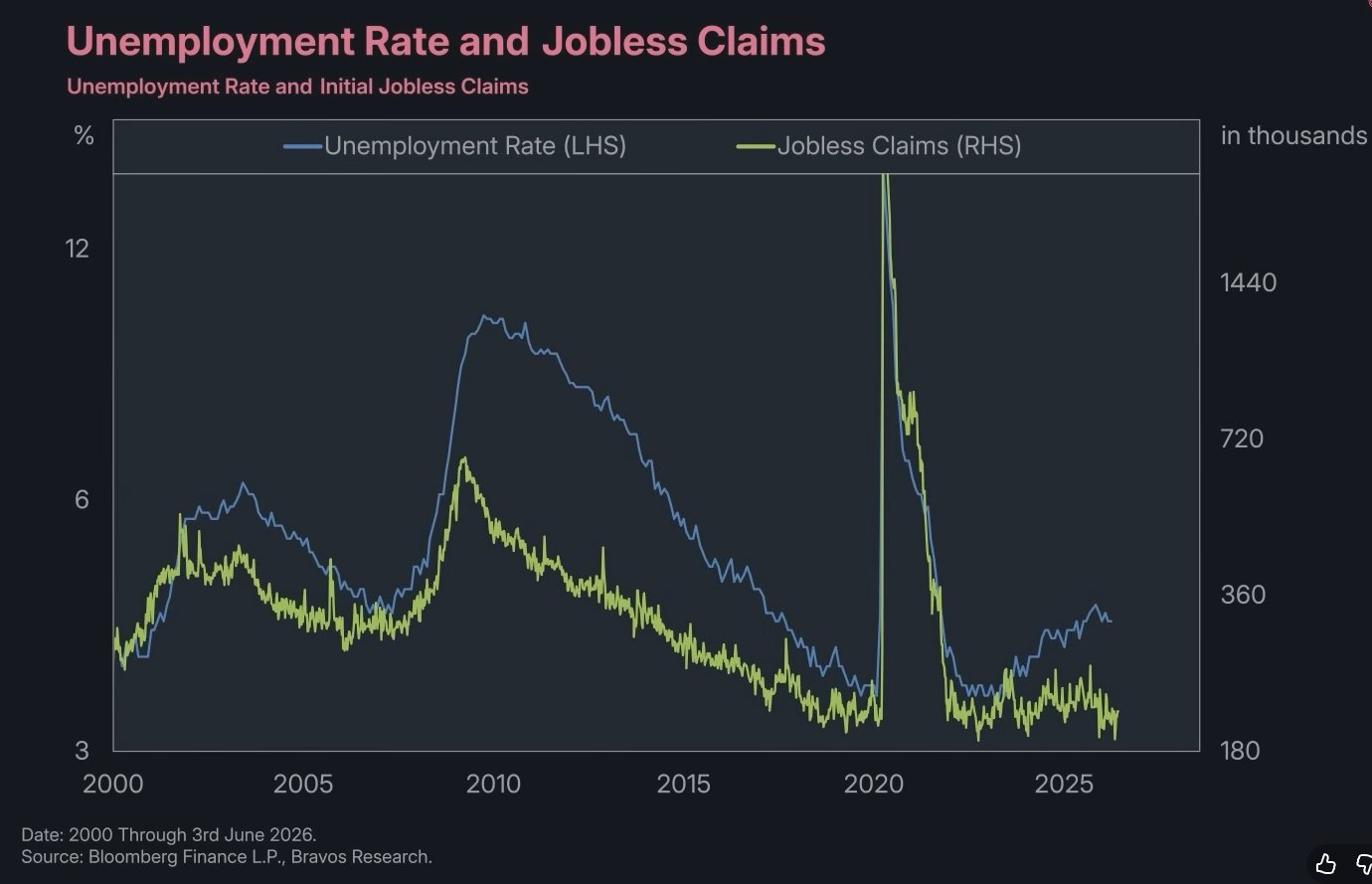
Unemployment Rate and Initial Jobless Claims. Source: Bloomberg Finance L.P., Bravos Research.
Initial jobless claims are near multi-decade lows, which is the chart admitting that companies are not actually firing people in large numbers. The May 2026 jobs report, released after the video, made the point harder. Payrolls came in at 172,000 against a consensus near 80,000, and unemployment held at 4.3 percent for a third straight month. The aggregate is resilient. The stress is in the composition, at the entry level and among the long-term unemployed, not in the level. Hold those two facts together. Capital is concentrating into a handful of AI bets, and the labor effect so far is concentrated at the bottom of the experience curve.
Where this already hit venture
For a fund whose thesis includes B2B SaaS, the abstract story stopped being abstract in February 2026.
In the first week of that month, software stocks shed more than a trillion dollars in market capitalization, by Forrester’s count, in a stretch the firm and others started calling the SaaSpocalypse. The trigger was the arrival of genuinely capable autonomous agents, including Anthropic’s Claude Cowork and Claude Code and OpenAI’s agent mode, and the market’s sudden conviction that per-seat software pricing is exposed when one agent does the work of several licensed users. The iShares Expanded Tech-Software ETF fell more than twenty percent in the first quarter. Salesforce and Workday dropped roughly thirty percent, Adobe traded near half its early-2025 level. The selloff recurred in April when Anthropic shipped managed agent hosting and the infrastructure names that sold those services separately, Cloudflare, Akamai, DigitalOcean, fell double digits in a day.
This is the same force the Bravos charts are pointing at, expressed in the one place a venture investor cannot look away from. Enterprises are moving budget toward AI infrastructure and agentic workflows and away from seat-based subscriptions. The market has decided that recurring revenue tied to human headcount is no longer the safe, compounding asset it was treated as for two decades. Whether the repricing is an overshoot or a permanent revaluation is the live debate, and reasonable people are on both sides. What is no longer debatable is that “we sell software by the seat” is a sentence that now carries risk it did not carry eighteen months ago.
Everything below follows from that.
For founders
The cost of building collapsed, and that cuts both ways. The same forces letting Amazon and Walmart run leaner let a seed-stage company reach real revenue with a fraction of the team the same milestone required five years ago. Small teams reaching seven and eight figures of revenue without raising are no longer anomalies. The practical effect is that the round you need to hit a given milestone is smaller, the team you hire against it is more senior, and the path to default-alive is shorter. The founder raising a large seed to hire twenty people is competing with a founder who raised a third of that and runs the same playbook with agents and five operators.
The junior-leverage model is over. The old way to scale was to hire cheap junior talent and supervise it. The Stanford data is the warning that the market is repricing exactly that labor, and your own company will feel it before your customers do. Staff with fewer, more experienced people and more tooling, and assume your competitors will too.
Pricing has to move with the buyer. Enterprise customers are revolting against paying for hundreds of licenses when a handful of agents do the work, which is the mechanism behind the SaaSpocalypse. Monetization is shifting toward consumption and outcomes, charging per resolved ticket or completed audit rather than per logged-in human. If your revenue model assumes seat growth that tracks your customer’s headcount, you are modeling a number your customer is actively trying to shrink.
Defensibility moved, and this is the screen that matters most. If a model release can rebuild your product, then having built it is not a moat. The durable positions are distribution, proprietary data, deep workflow integration, switching costs, and regulatory standing. A pitch that amounts to “we built this with AI” describes a feature with a short half-life, because the thing AI made cheap for you to build it made cheap for the next four teams as well. The question to answer in your own deck is what survives the next capability jump.
For VCs
The capital picture is a barbell and the middle is thin. Enormous sums flow into AI labs and infrastructure at the top while the long tail of early and growth stage competes for what is left. For a pre-seed and seed manager this is threat and opportunity in one motion. The threat is that the Series A bar rises, because the comparison is no longer the other startup, it is whether an incumbent could do this with agents, and graduation rates fall. The opportunity is that entry prices for unglamorous categories outside the AI narrative stay reasonable while everyone crowds the hyped end.
Underwriting has to change with the margin structure. Classic SaaS earned eighty percent gross margins because code was written once and copied for free. AI-native products carry real compute and token costs in cost of goods sold. Top-line ARR is no longer a clean proxy for quality. Net revenue retention and contribution margin after compute are the numbers that separate a durable business from a venture-subsidized demo, and the SaaSpocalypse is the market enforcing that distinction in public.
The selection question sharpened into one test. Are you backing companies that AI makes possible, or companies that AI makes obsolete. A product the next model delivers for free is a capability-timing bet that the timing runs out on, and it looks identical to a great company right up until it does not. That is the failure mode worth screening hardest for.
Markups are not returns, and this is the cycle where the distinction bites. AI-adjacent positions are being marked up on the same enthusiasm carrying the public indices, and the historical rhyme is the telecom and dot-com overbuild, where the infrastructure thesis was correct and most of the early equity was still wiped out. Taking partial liquidity through secondaries on inflated positions is discipline, not a lack of conviction.
The one lesson to refuse is the video’s own. It exists to sell market timing, and venture is the asset class where timing the macro is least available to you. You cannot call whether the capex cycle runs a decade like the railroads or cracks in eighteen months like the fiber buildout. Deploy through it with disciplined entry prices and let the volume of bets carry the uncertainty, because the honest read on which way this breaks is that nobody knows.
For LPs
The liquidity problem is no longer a forecast, it is a measured fact, and it is severe. Net cash flows from venture funds to LPs have been negative by about 169 billion dollars since 2022, per PitchBook and NVCA data. The median 2017-vintage fund, now eight years old, has returned roughly a quarter of paid-in capital, with median DPI around 0.28x. Newer vintages are worse, with only single-digit percentages of 2021 funds having returned any cash at all after three years. Distribution rates have run at single-digit percentages of net asset value for eight straight quarters against a decade average near seventeen percent. This is the backdrop against which every fund you are offered is being raised.
The diversification you think you have is thinner than it looks. If AI capex is simultaneously driving GDP, dominating the public indices through a handful of names, financing itself through private credit on data centers, and setting valuations across venture, then a portfolio holding all four is not diversified across risks. It is four expressions of one bet on the AI capex cycle continuing. The venture allocation that was sold as uncorrelated is now correlated to the same names that move the S&P, and the SaaSpocalypse showed how fast a single product launch can reprice the lot.
Secondaries have gone from a workaround to plumbing, and you should use them as such without expecting them to fix the underlying problem. The secondary market has grown past 150 billion dollars in annual volume, Goldman Sachs paid up to 965 million for Industry Ventures to build a position in it, and continuation vehicles are now a standard tool for GPs who want to hold AI assets past fund life. PitchBook’s own read is blunt, that secondaries provide a liquidity lifeline but lack the capacity to resolve the DPI crisis. They rebalance the problem, they do not retire it.
Weight realized cash over paper, and entry discipline over theme exposure. Every manager you meet is now an AI manager, so the question is not whether a fund is exposed to AI, it is the price at which it entered and whether it holds reserves to defend positions if the cycle turns. A fund deployed at the top of the valuation cycle into AI-adjacent companies at inflated prices carries vintage risk that no amount of thesis eloquence removes (this is less of an issue in Pre-Seed where we mostly invest). With public exit windows thin, the manager who can show a path to actual distributions is worth more than the one with the prettier markup.
Finally, hold both skeptical positions at once. The base rate on technology-displacement panic is poor. The radiologists are still employed, the people who said otherwise are on record, and a video that prints “2x” over a chart showing two-thirds should lower your trust, not raise it. At the same time, the entry-level data is real, the SaaSpocalypse was real cash leaving real portfolios, and complacency is its own mistake. The position that survives both is not a forecast. It is high uncertainty, which is the case for spreading bets across volume rather than concentrating them on whichever narrative is loudest this quarter.
What to take from the charts
The divergence is worth your attention, and not for the reason it is being shared. The labor story it implies is weaker than it looks, propped up by an inverted axis, a fabricated multiple, and a chart that cannot show its own claim. The capital story underneath is stronger than the people selling it seem to realize, and it is the one with teeth for anyone managing a fund. Money is concentrating into a narrow set of AI bets, the cost of building has fallen far enough to reshape what a startup needs to raise and who it hires, the labor effect that is real is hitting the on-ramp where it is hardest to see, and the whole thing has already reached venture through the repricing of seat-based software.
None of that resolves into a trade you can put on this week. It resolves into discipline. Price your entries, weight your bets across the uncertainty, take some chips off the table when it is offered, and treat any chart that ends in a sales pitch as the beginning of your own work rather than the end of it.